Tableau
Tableau
As the market-leading choice for modern business intelligence, our analytics platform makes it easier for people to explore and manage data, and faster to discover and share insights that can change businesses and the world.
Everything we do is driven by our mission to help people see and understand data, which is why our products are designed to put the user first—whether they’re an analyst, data scientist, student, teacher, executive, or business user. From connection through collaboration, Tableau is the most powerful, secure, and flexible end-to-end analytics platform.Power BI is a collection of software services, apps, and connectors that work together to turn your unrelated sources of data into coherent, visually immersive, and interactive insights. Your data may be an Excel spreadsheet, or a collection of cloud-based and on-premises hybrid data warehouses. Power BI lets you easily connect to your data sources, visualize and discover what's important, and share that with anyone or everyone you want.
Get Started with Tableau Desktop
This tutorial walks you through the features and functions of Tableau Desktop version 2022.2. As you work through this tutorial, you will create multiple views in a Tableau workbook. The steps you'll take and the workbook you'll work in are based on a story about an employee who works at headquarters for a large retail chain. The story unfolds as you step through asking questions about your business and its performance.
You'll learn how to connect to data in Tableau Desktop; build, present, and share some useful views; and apply key features along the way. Budget between one and three hours to complete the steps.
Here's the story...
Suppose you are an employee for a large retail chain. Your manager just got the quarterly sales report, and noticed that sales seem better for some products than for others and profit in some areas is not doing as well as she had expected. Your boss is interested in the bottom line: It's your job to look at overall sales and profitability to see if you can find out what's driving these numbers.
She has also asked you to identify areas for improvement and present your findings to the team. The team can explore your results and take action to improve sales and profitability for the company's product lines.
You'll use Tableau Desktop to build a simple view of your product data, map product sales and profitability by region, build a dashboard of your findings, and then create a story to present. Then, you will share your findings on the web so that remote team members can take a look.
STEPS
Step 1: Connect to your data
Step 2: Drag and drop to take a first look
Step 3: Focus your results
Ask deeper questions and use additional tools to refine your views and gain insights about your data.
Step 4: Explore your data geographically
Step 5: Drill down into the details
Step 6: Build a dashboard to show your insights
Step 7: Build a story to present
Step 8: Share your findings
Share your findings with your organization on Tableau Server or Tableau Online, or share them with the world on Tableau Public.
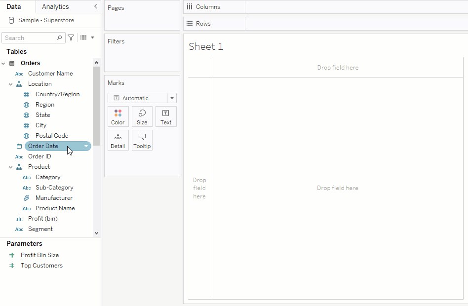
Step 1: Connect to your data
Your manager has asked you to look into the overall sales and profitability for the company and to identify key areas for improvement. You have a bunch of data, but you aren’t sure where to start. With a free trial of Tableau Desktop(Link opens in a new window), you decide to begin there.
Open Tableau Desktop and begin
The first thing you see after you open Tableau Desktop is the Start page(Link opens in a new window). Here, you select the connector (how you will connect to your data) that you want to use.
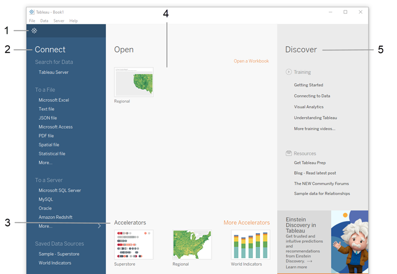
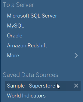
The Sample - Superstore data set comes with Tableau. It contains information about products, sales, profits, and so on that you can use to identify key areas for improvement within this fictitious company.
Step 2: Drag and drop to take a first look
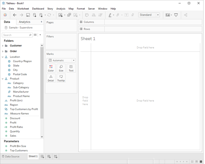
Create a view
You set out to identify key areas for improvement, but where to start? With four years' worth of data, you decide to drill into the overall sales data to see what you find. Start by creating a simple chart.
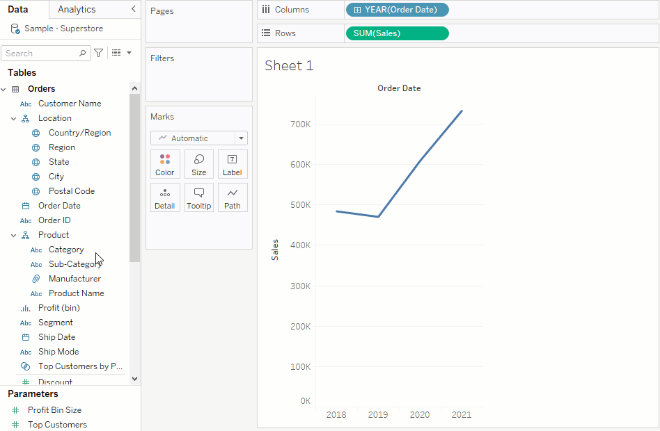
- From the Data pane, drag Order Date to the Columns shelf.
Note: When you drag Order Date to the Columns shelf, Tableau creates a column for each year in your data set. Under each column is an Abc indicator. This indicates that you can drag text or numerical data here, like what you might see in an Excel spreadsheet. If you were to drag Sales to this area, Tableau creates a crosstab (like a spreadsheet) and displays the sales totals for each year.
- From the Data pane, drag Sales to the Rows shelf. Tableau generates the following chart with sales rolled up as a sum (aggregated). You can see total aggregated sales for each year by order date.
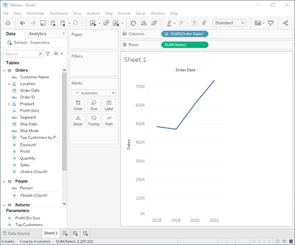
When you first create a view that includes time (in this case Order Date), Tableau automatically generates a line chart.
This line chart shows that sales look pretty good and seem to be increasing over time. This is good information, but it doesn't really tell you much about which products have the strongest sales and if there are some products that might be performing better than others. Since you just got started, you decide to explore further and see what else you can find out.
Refine your view
To gain more insight into which products drive overall sales, try adding more data. Start by adding the product categories to look at sales totals in a different way.
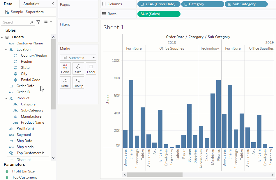
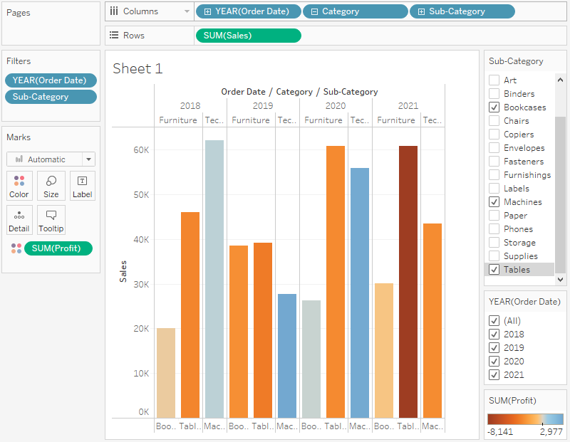
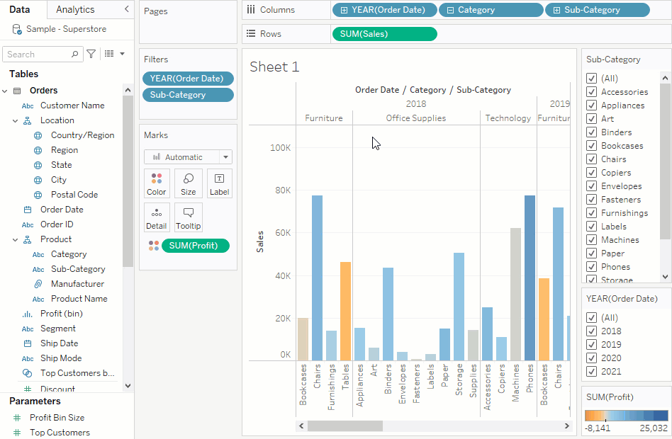
- From the Data pane, drag Category to the Columns shelf and place it to the right of YEAR(Order Date).
Your view updates to a bar chart. By adding a second discrete dimension to the view you can categorize your data into discrete chunks instead of looking at your data continuously over time. This creates a bar chart and shows you overall sales for each product category by year.
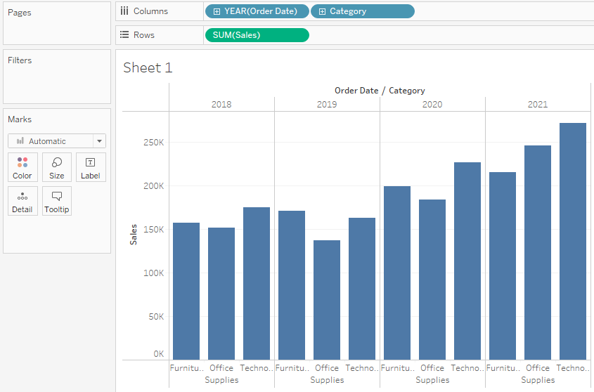
Your view is doing a great job showing sales by category—furniture, office supplies, and technology. An interesting insight is revealed!
From this view, you can see that sales for furniture is growing faster than sales for office supplies, even though Office Supplies had a really good year in 2021. Perhaps you can recommend that your company focus sales efforts on furniture instead of office supplies? Your company sells a lot of different products in those categories, so you'll need more information before you can make a recommendation.
To help answer that question, you decide to look at products by sub-category to see which items are the big sellers. For example, for the Furniture category, you want to see details about bookcases, chairs, furnishings, and tables. Looking at this data might help you gain insights into sales and later on, overall profitability, so add sub-categories to your bar chart.
- Double-click or drag Sub-Category to the Columns shelf.
Note: You can drag and drop or double-click a field to add it to your view, but be careful. Tableau makes assumptions about where to add that data, and it might not be placed where you expect. You can always click Undo to remove the field, or drag it off the area where Tableau placed it to start over.
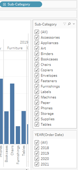
Sub-Category is another discrete field. It creates another header at the bottom of the view, and shows a bar for each sub-category (68 marks) broken down by category and year.
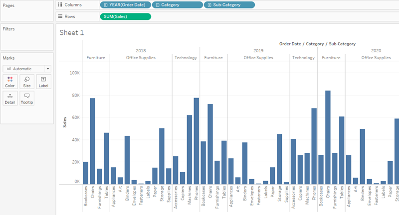
Now you are getting somewhere, but this is a lot of data to visually sort through. In the next section, you will learn how you can add color, filters, and more to focus on specific results.
Step 3: Focus your results
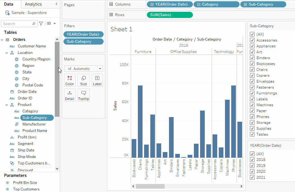
You can use filters to include or exclude values in your view. In this example, you decide to add two simple filters to your worksheet to make it easier to look at product sales by sub-category for a specific year.
-
In the Data pane, right-click Order Date and select Show Filter.
-
Repeat the step above for the Sub-Category field.
The filters are added to the right side of your view in the order that you selected them. Filters are card types and can be moved around on the canvas by clicking on the filter and dragging it to another location in the view. As you drag the filter, a line appears that shows you where you can drop the filter to move it.
Note: The Get Started tutorial uses the default position of the filter cards.
Add color to your view
Adding filters helps you to sort through all of this data—but wow, that’s a lot of blue! It's time to do something about that.
Currently, you are looking at sales totals for your various products. You can see that some products have consistently low sales, and some products might be good candidates for reducing sales efforts for those product lines. But what does overall profitability look like for your different products? Drag Profit to color to see what happens.
From the Data pane, drag Profit to Color on the Marks card.
By dragging profit to color, you now see that you have negative profit in Tables, Bookcases, and even Machines. Another insight is revealed!
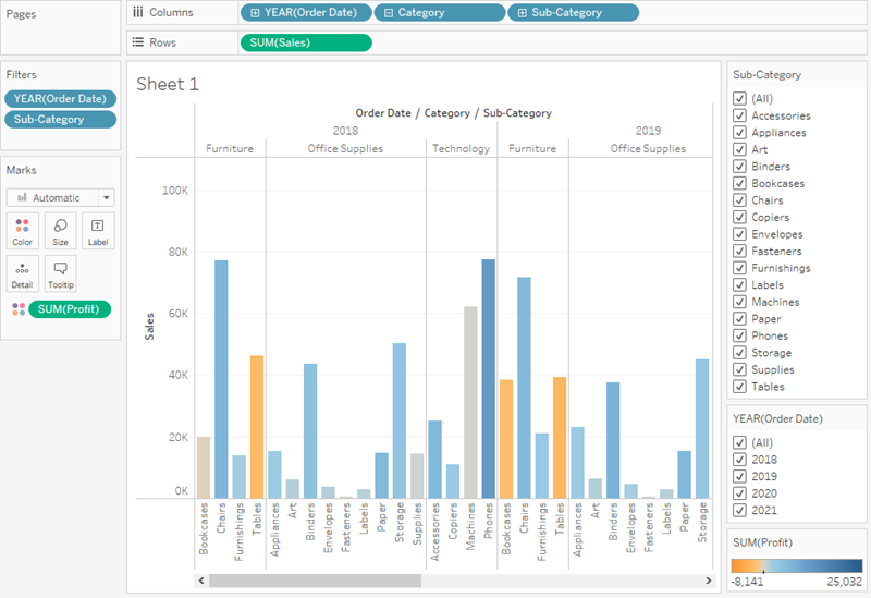
Note: Tableau automatically added a color legend and assigned a diverging color palette because your data includes both negative and positive values.
Find key insights
As you've learned, you can explore your data as you build views with Tableau Desktop. Adding filters and colors helps you better visualize your data and can identify problems right away.
The next step is to interact with your view so that you can begin drawing conclusions.
Looking at your view, you saw that you had some unprofitable products, but now you want to see if these products have been unprofitable year over year.
It's time to use your filters to take a closer look.
1) In the view, in the Sub-Category filter card, clear all of the check boxes except Bookcases, Machines, and Tables.
Now you can see that, in some years, Bookcases and Machines were profitable. However, recently Machines are unprofitable. While you've made an important discovery, you want to gather more information before proposing any action items to your boss.
On a hunch, you decide to break up your view by region:
2) Select All in the Sub-Category filter card to show all sub-categories again.
3) From the Data pane, drag Region to the Rows shelf and place it to the left of Sum(Sales).
Tableau creates a view with multiple axes broken down by region.
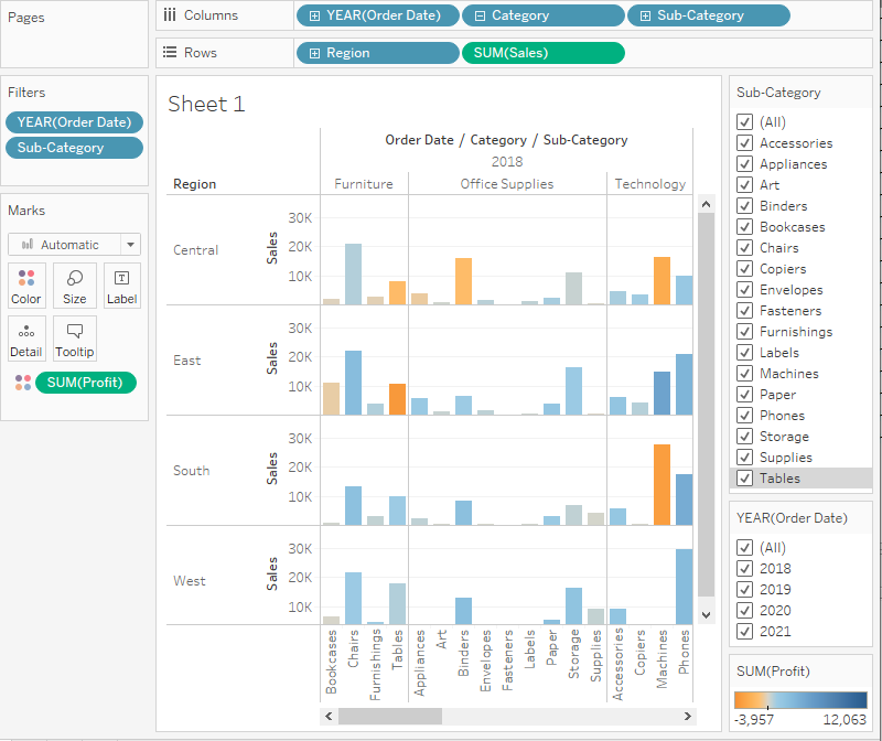
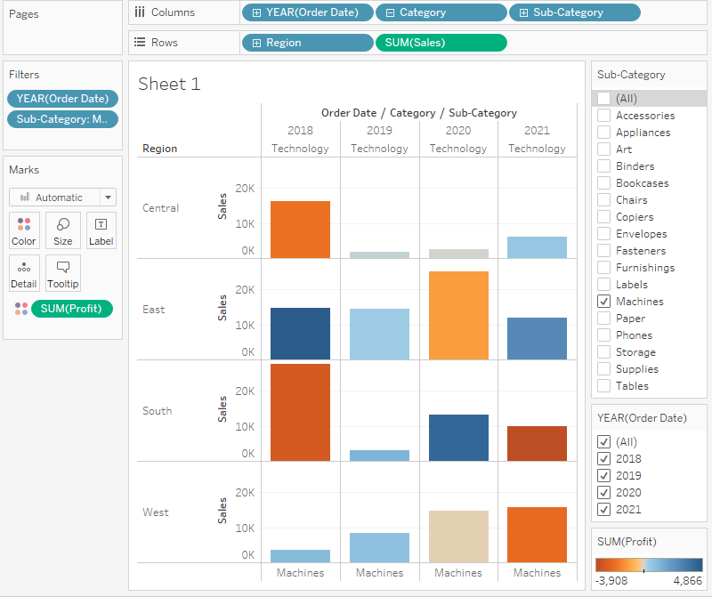
Now you see sales and profitability by product for each region. By adding region to the view and filtering the Sub-Category for Machines only, you notice that machines in the South are reporting a higher negative profit overall than in your other regions. You've discovered a hidden insight!
This view best encapsulates your work so far. Select All in the Sub-Category filter card (if you changed your filter) to show all sub-categories again, name the worksheet, and add a title.
4) At the bottom-left of the workspace, double-click Sheet 1 and type Sales by Product/Region.
You choose to focus your analysis on the South, but you don't want to lose the view you've created. In Tableau Desktop, you can duplicate your worksheet to continue where you left off.
5) In your workbook, right-click the Sales by Product/Region sheet and select Duplicate.
6) Rename the duplicated sheet to Sales in the South.
7) In your new worksheet, from the Data pane, drag Region to the Filters shelf to add it as a filter in the view.
8) In the Filter Region dialog box, clear all check boxes except South and then click OK.
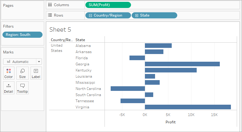
Your view updates to look like the image below.
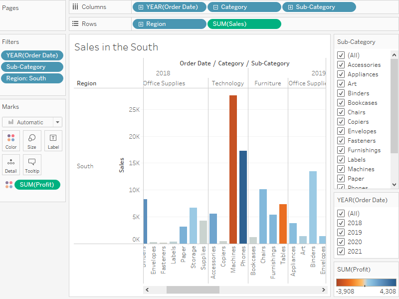
Now you can focus on sales and profit in the South. You immediately see that machine sales had negative profit in 2018 and again in 2021. This is definitely something to investigate!
9) Save your work by selecting File > Save As. Give your workbook a name, such as Regional Sales and Profits. Learn more: How Tableau organizes your saved workbooks
Check your work! Watch "Find key insights" in action below
Step 4: Explore your data geographically
You've built a great view that allows you to review sales and profits by product over several years. And after looking at product sales and profitability in the South, you decide to look for trends or patterns in that region.
Because you're looking at geographic data (the Region field), you have the option to build a map view. Map views are great for displaying and analyzing this kind of information. Plus, they're just cool!
For this example, Tableau has already assigned the proper geographic roles to the Country, State, City, and Postal Code fields. That's because it recognized that each of those fields contained geographic data. You can get to work creating your map view right away.
Build a map view
Start fresh with a new worksheet.
1) Click the New worksheet icon at the bottom of the workspace.
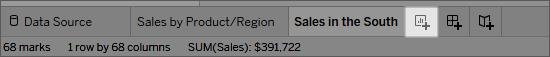
Tableau keeps your previous worksheet and creates a new one so that you can continue exploring your data without losing your work.
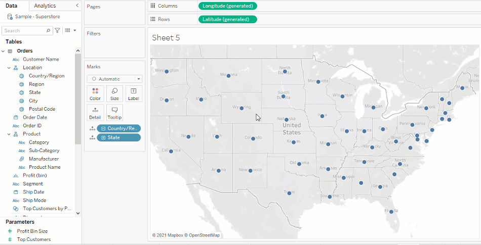
2) In the Data pane, double-click State to add it to Detail on the Marks card.
Now you’ve got a map view!
Because Tableau already knows that state names are geographic data and because the State dimension is assigned the State/Province geographic role, Tableau automatically creates a map view.
There is a mark for each of the 48 contiguous states in your data source. (Sadly, Alaska and Hawaii aren't included in your data source, so they are not mapped.)
Notice that the Country field is also added to the view. This happens because the geographic fields in Sample - Superstore are part of a hierarchy. Each level in the hierarchy is added as a level of detail.
Additionally, Latitude and Longitude fields are added to the Columns and Rows shelves. You can think of these as X and Y fields. They're essential any time you want to create a map view, because each location in your data is assigned a latitudinal and longitudinal value. Sometimes the Latitude and Longitude fields are generated by Tableau. Other times, you might have to manually include them in your data. You can find resources to learn more about this in the Learning Library.
Now, having a cool map focused on 48 states is one thing, but you wanted to see what was happening in the South, remember?
3) Drag Region to the Filters shelf, and then filter down to the South only. The map view zooms in to the South region, and there is a mark for each state (11 total).
Now you want to see more detailed data for this region, so you start to drag other fields to the Marks card:
4) Drag the Sales measure to Color on the Marks card.
The view automatically updates to a filled map, and colors each state based on its total sales. Because you're exploring product sales, you want your sales to appear in USD. Click the Sum(Sales) field on the Columns shelf, and select Format. For Numbers, select Currency.
Any time you add a continuous measure that contains positive numbers (like Sales) to Color on the Marks card, your filled map is colored blue. Negative values are assigned orange.
Sometimes you might not want your map to be blue. Maybe you prefer green, or your data isn’t something that should be represented with the color blue, like wildfires or traffic jams. That would just be confusing!
No need to worry, you can change the color palette just like you did before.
5) Click Color on the Marks card and select Edit Colors. For this example, you want to see which states are doing well, and which states are doing poorly in sales.
6) In the Palette drop-down list, select Red-Green Diverging and click OK. This allows you to see quickly the low performers and the high performers.
Your view updates to look like this:
But wait. Everything just went red! What happened?
The data is accurate, and technically you can compare low performers with high performers, but is that really the whole story?
Are sales in some of those states really that terrible, or are there just more people in Florida who want to buy your products? Maybe you have smaller or fewer stores in the states that appear red. Or maybe there’s a higher population density in the states that appear green, so there are just more people to buy your stuff.
Either way, there’s no way you want to show this view to your boss because you aren't confident the data is telling a useful story.
7) Click the Undo icon in the toolbar to return to that nice, blue view.
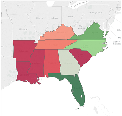
There’s still a color problem. Everything looks dandy—that’s the problem!
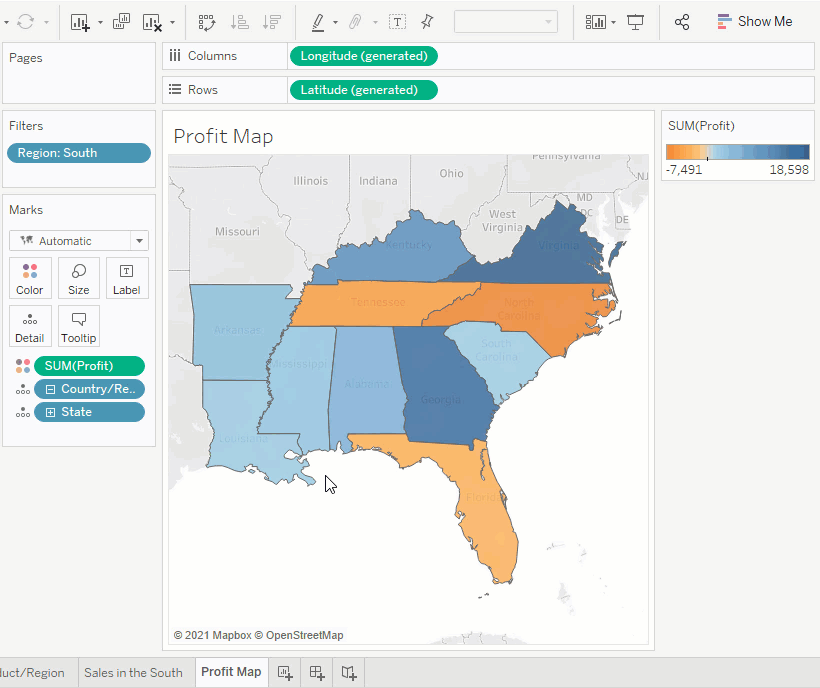
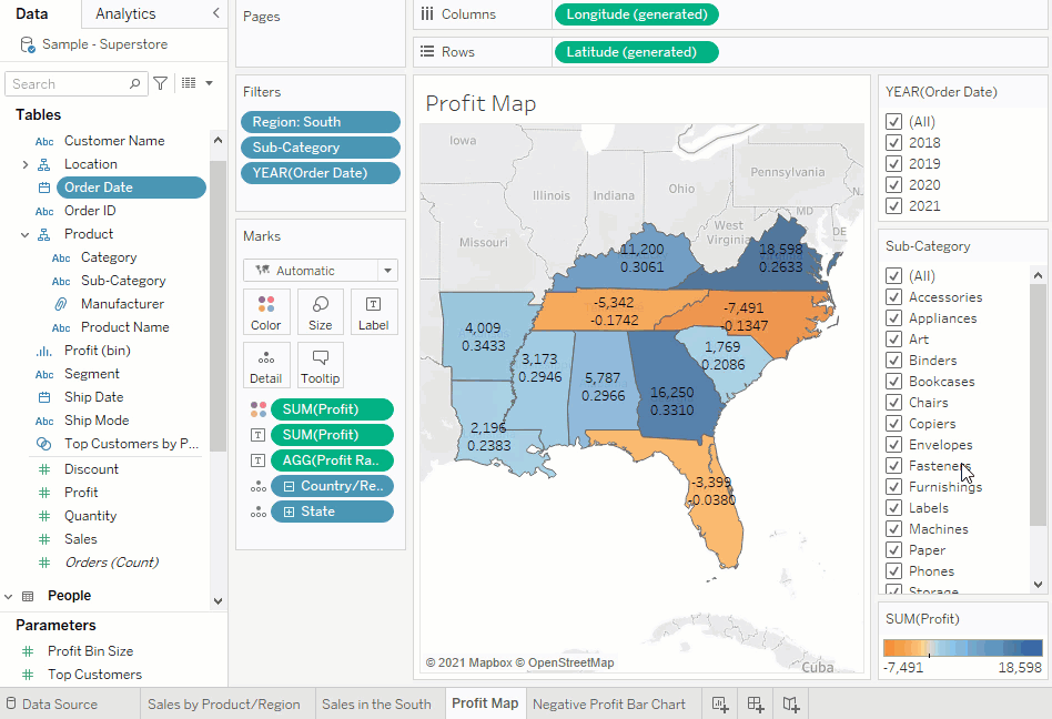
At first glance, it appears that Florida is performing the best. Hovering over its mark reveals a total of 89,474 USD in sales, as compared to South Carolina, for example, which has only 8,482 USD in sales. However, have any of the states in the South been profitable?
8) Drag Profit to Color on the Marks card to see if you can answer this question.
Now that’s better! Because profit often consists of both positive and negative values, Tableau automatically selects the Orange-Blue Diverging color palette to quickly show the states with negative profit and the states with positive profit.
It’s now clear that Tennessee, North Carolina, and Florida have negative profit, even though it appeared they were doing okay—even great—in Sales. But why? You'll answer that in the next step.
Check your work! Watch "Build a map view" in action
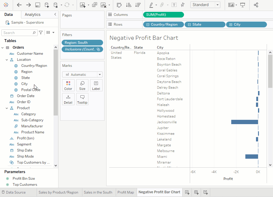
Step 5: Drill down into the details
In the last step you discovered that Tennessee, North Carolina, and Florida have negative profit. To find out why, you decide to drill down even further and focus on what's happening in those three states alone.
Pick up where your map view left off
As you saw in the last step, maps are great for visualizing your data broadly. A bar chart will help you get into the nitty-gritty. To do this, you create another worksheet.
1) Double-click Sheet 3 and name the worksheet Profit Map.
2) Right-click Profit Map at the bottom of the workspace and select Duplicate . Name the new sheet Negative Profit Bar Chart.
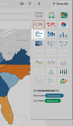
3) In the Negative Profit Bar Chart worksheet, click Show Me, and then select horizontal bars.
Show Me highlights different chart types based on the data you've added to your view.
Note: At any time, you can click Show Me again to collapse it.
You now have a bar chart again—just like that.
4) To select multiple bars on the left, click and drag your cursor across the bars between Tennessee, North Carolina, and Florida. On the tooltip that appears, select Keep Only to focus on those three states.
Note: You can also right-click one of the highlighted bars, and select Keep Only.
Notice that an Inclusions field for State is added to the Filters shelf to indicate that certain states are filtered from the view. The icon with two circles on the field indicates that this field is a set. You can edit this field by right-clicking the field on the Filters shelf and selecting, Edit Filter.
Now you want to look at the data for the cities in these states.
5) On the Rows shelf, click the plus icon on the State field to drill-down to the City level of detail.
There’s almost too much information here, so you decide to filter the view down to the cities with the most negative profit by using a Top N Filter.
Check your work! Watch steps 1-5 in action
Create a Top N Filter
You can use a Top N Filter in Tableau Desktop to limit the number of marks displayed in your view. In this case, you want to use the Top N Filter to hone in on poor performers.
1) From the Data pane, drag City to the Filters shelf.
2) In the Filter dialog box, select the Top tab, and then do the following:
-
Click By field.
-
Click the Top drop-down and select Bottom to reveal the poorest performers.
-
Type 5 in the text box to show the bottom 5 performers in your data set.
Tableau Desktop has already selected a field (Profit) and aggregation (Sum) for the Top N Filter based on the fields in your view. These settings ensure that your view will display only the five poorest performing cities by sum of profit.
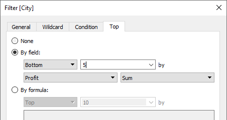
- Click OK.
What happened to the bar chart, and why is it blank? That's a great question, and a great opportunity to introduce the Tableau Order of Operations.
The Tableau Order of Operations, also known as the query pipeline, is the order that Tableau performs various actions, such as the order in which it applies your filters to the view.
Tableau applies filters in the following order:
-
Extract Filters
-
Data Source Filters
-
Context Filters
-
Top N Filters
-
Dimension Filters
-
Measure Filters
The order that you create filters in, or arrange them on the Filters shelf, doesn't change the order in which Tableau applies those filters to your view.
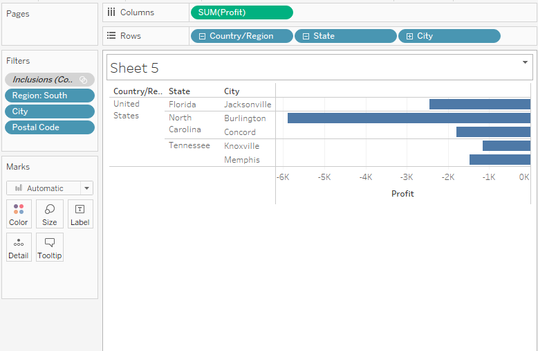
The good news is you can tell Tableau to change this order when you notice something strange happening with the filters in your view. In this example, the Top N Filter is applied to the five poorest performing cities by sum of profit for the whole map, but none of those cities are in the South, so the chart is blank.
To fix the chart, add a filter to context. This tells Tableau to filter that field first, regardless of where it falls on the order of operations.
But which field do you add to context? There are three fields on the Filters shelf: Region (a dimension filter), City (a top N filter), and Inclusions (Country, State) (Country, State) (a set).
If you look at the order of operations again, you know that the set and the top N filter are being applied before the dimension filter. But do you know if the top N filter or the set filter is being applied first? Let's find out.
3) On the Filters shelf, right-click the City field and select Add to Context. The City field turns gray and moves to the top of the Filters shelf, but nothing changes in the view. So even though you're forcing Tableau to filter City first, the issue isn't resolved.
4) Click Undo.
5) On the Filters shelf, right-click the Inclusions (Country, State) (Country, State) set and select Add to Context.
The Inclusions (Country, State) (Country, State) set turns gray and moves to the top of the Filters shelf. And bars have returned to your view!
You're on to something! But there are six cities in the view, including Jacksonville, North Carolina, which has a positive profit. Why would a city with a positive profit show up in the view when you created a filter that was supposed to filter out profitable cities?
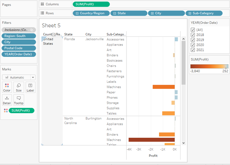
Jacksonville, North Carolina is included because City is the lowest level of detail shown in the view. For Tableau Desktop to know the difference between Jacksonville, North Carolina, and Jacksonville, Florida, you need to drill down to the next level of detail in the location hierarchy, which, in this case, is Postal Code. After you add Postal Code, you can exclude Jacksonville in North Carolina without also excluding Jacksonville in Florida.
6) On the Rows shelf, click the plus icon on City to drill down to the Postal Code level of detail.
7) Right-click the postal code for Jacksonville, North Carolina, 28540, and then select Exclude.
Postal Code is added to the Filters shelf to indicate that certain members in the Postal Code field have been filtered from the view. Even when you remove the Postal Code field from the view, the filter remains.
8) Drag Postal Code off the Rows shelf.
Your view updates to look like this:
Check your work! Watch steps 1-8 in action
Now that you've focused your view to the least profitable cities, you can investigate further to identify the products responsible.
Identify the troublemakers
You decide to break up the view by Sub-Category to identify the products dragging profit down. You know that the Sub-Category field contains information about products sold by location, so you start there.
-
Drag Sub-Category to the Rows shelf, and place it to the right of City.
-
Drag Profit to Color on the Marks card to make it easier to see which products have negative profit.
-
In the Data pane, right-click Order Date and select Show Filter.
You can now explore negative profits for each year if you want, and quickly spot the products that are losing money.
Machines, tables, and binders don’t seem to be doing well. So what if you stop selling those items in Jacksonville, Concord, Burlington, Knoxville, and Memphis?
Verify your findings
Will eliminating binders, machines, and tables improve profits in Florida, North Carolina, and Tennessee? To find out, you can filter out the problem products to see what happens.
-
Go back to your map view by clicking the Profit Map sheet tab.
-
In the Data pane, right-click Sub-Category and select Show Filter. A filter card for all of the products you offer appears next to the map view. You'll use this filter later.
-
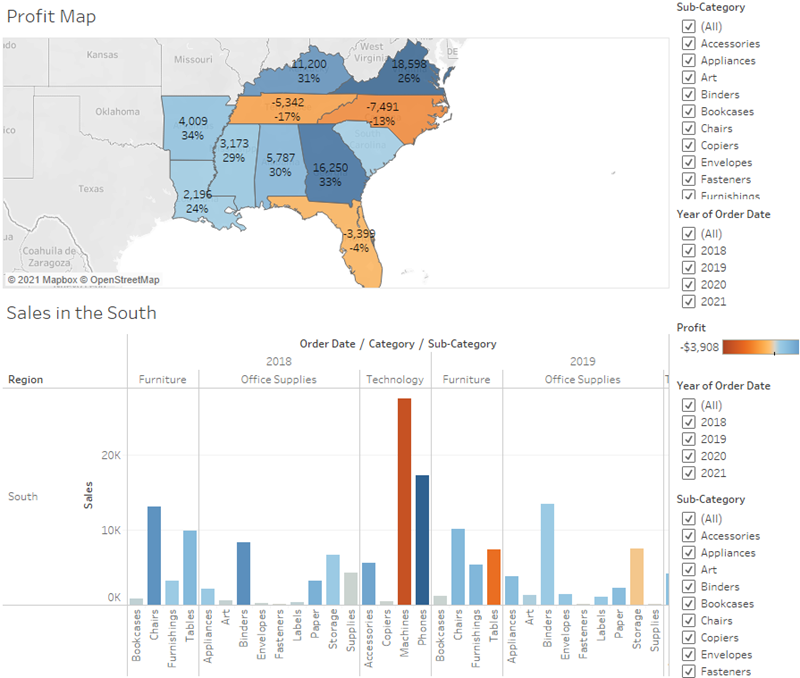
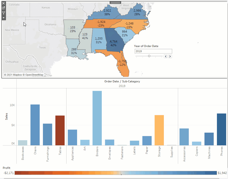
From the Data pane, drag Profit and Profit Ratio to Label on the Marks card. To format the Profit Ratio as a percentage, right-click Profit Ratio, and select Format. Then, for Default Numbers, choose Percentage and set the number of decimal places you want displayed on the map. For this map, we'll choose zero decimal places. Now you can see the exact profit of each state without having to hover your cursor over them.
-
In the Data pane, right-click Order Date and select Show Filter to provide some context for the view. A filter card for YEAR(Order Date) appears in the view. You can now view profit for all years or for a combination of years. This might be useful for your presentation.
-
Clear Binders, Machines, and Tables from the list on the Sub-Category filter card in the view.
Recall that adding filters to your view lets you include and exclude values to highlight certain parts of your data.
As you clear each member, the profit for Tennessee, North Carolina, and Florida improve, until finally, each has a positive profit.
Hey, you made an interesting discovery!
Binders, machines, and tables are definitely responsible for the losses in Tennessee, North Carolina, and Florida, but not for the rest of the South. Do you notice how profit actually decreases for some of the other states as you clear items from the filter card? For example, if you toggle Binders on the Sub-Category filter card, profit drops by four percent in Arkansas. You can deduce that Binders are actually profitable in Arkansas.
You want to share this discovery with the team by walking them through the same steps you took.
6) Select (All) on the Sub-Category filter card to include all products again. Learn more: More questions you could ask Check your work! Watch "Verify your findings" in action
Now you know that machines, tables, and binders are problematic products for your company. In focusing on the South, you see that these products have varying impacts on profit. This might be a worthwhile conversation to have with your boss.
Next, you'll assemble the work you've done so far in a dashboard so that you can clearly present your findings.
Step 6: Build a dashboard to show your insights
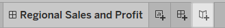
You’ve created four worksheets, and they're communicating important information that your boss needs to know. Now you need a way to show the negative profits in Tennessee, North Carolina, and Florida and explain some of the reasons why profits are low.
To do this, you can use dashboards to display multiple worksheets at once, and—if you want—make them interact with one another.
Set up your dashboard
You want to emphasize that certain items sold in certain places are doing poorly. Your bar graph view of profit and your map view demonstrate this point nicely.
1) Click the New dashboard button.

2) In the Dashboard pane on the left, you'll see the sheets that you created. Drag Sales in the South to your empty dashboard.
3) Drag Profit Map to your dashboard, and drop it on top of the Sales in the South view.
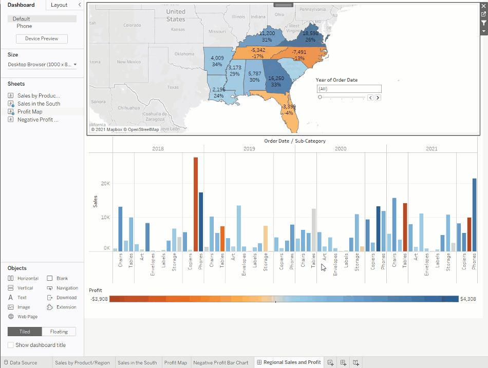
Your view will update to look like this:
Now you can see both views at once! But sadly, the bar chart is a bit squished, which isn’t helping your boss understand your data.
Arrange your dashboard
It's not easy to see details for each item under Sub-Category from your Sales in the South bar chart. Also, because we have the map in view, we probably don't need the South region column in Sales in the South, either.
Resolving these issues will give you more room to communicate the information you need.
1) On Sales in the South, right-click in the column area under the Region column header, and clear Show header.
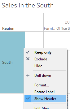
2) Repeat this process for the Category row header.
You've now hidden unnecessary columns and rows from your dashboard while preserving the breakdown of your data. The extra space makes it easier to see data on your dashboard, but let's freshen things up even more.
3) Right-click the Profit Map title and select Hide Title. The title Profit Map is hidden from the dashboard and even more space is created.
4) Repeat this step for the Sales in the South view title.
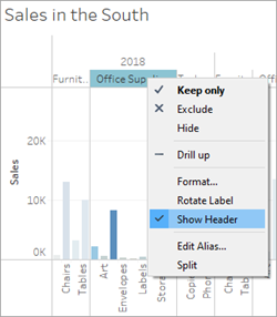
5) Select the first Sub-Category filter card on the right side of your view, and at the top of the card, click the Remove icon .
6) Repeat this step for the second Sub-Category filter card and one of the Year of Order Date filter cards.
7) Click on the Profit color legend and drag it from the right to below Sales in the South.
8) Finally, select the remaining Year of Order Date filter, click its drop-down arrow, and then select Floating. Move it to the white space in the map view. In this example, it is placed just off the East Coast, in the Atlantic Ocean.
Try selecting different years on the Year of Order Date filter. Your data is quickly filtered to show that state performance varies year by year. That's nice, but it could be made even easier to compare.
9) Click the drop-down arrow at the top of the Year of Order Date filter, and select Single Value (Slider).
Your view updates to look like this:
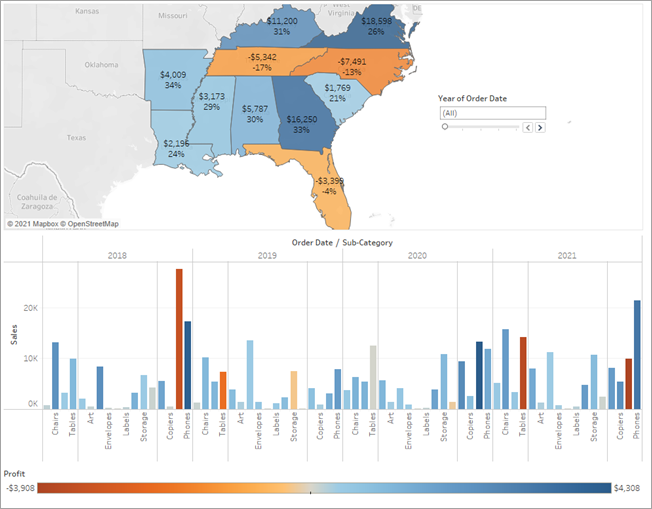
Now your dashboard is looking really good! Now, you can easily compare profit and sales by year. But that’s not so different from a couple pictures in a presentation—and you're using Tableau! Let's make your dashboard more engaging.
Check your work! Watch "Arrange your dashboard" in action
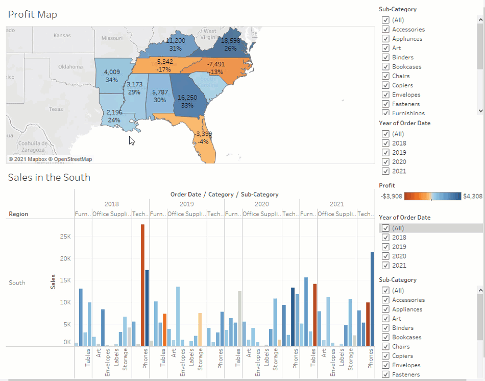
Add interactivity
Wouldn't it be great if you could view which sub-categories are profitable in specific states?
-
Select Profit Map in the dashboard, and click the Use as filter icon in the upper right corner.
-
Select a state within the Southern region of the map. The Sales in the South bar chart automatically updates to show just the sub-category sales in the selected state. You can quickly see which sub-categories are profitable.
-
Click an area of the map other than the colored Southern states to clear your selection. You also want viewers to be able to see the change in profits based on the order date.
-
Select the Year of Order Date filter, click its drop-down arrow, and select Apply to Worksheets > Selected Worksheets.
-
In the Apply Filter to Worksheets dialog box, select All in dashboard, and then click OK.
This option tells Tableau to apply the filter to all worksheets in the dashboard that use this same data source.
Explore state performance by year with your new, interactive dashboard!
Check your work! Watch "Add interactivity" in action
Here, we filter Sales in the South to only items sold in North Carolina, and then explore year by year profit.
Rename and go
You show your boss your dashboard, and she loves it. She's named it "Regional Sales and Profit," and you do the same by double-clicking the Dashboard 1 tab and typing Regional Sales and Profit.
In her investigations, your boss also finds that the decision to introduce machines in the North Carolina market in 2021 was a bad idea.
Your boss is glad she has this dashboard to explore, but she also wants you to present a clear action plan to the larger team. She asks you to create a presentation with your findings.
Step 7: Build a story to present
You want to share your findings with the larger team. Together, your team might reevaluate selling machines in North Carolina.
Instead of having to guess which key insights your team is interested in and including them in a presentation, you decide to create a story in Tableau. This way, you can walk viewers through your data discovery process, and you have the option to interactively explore your data to answer any questions that come up during your presentation.
Create your first story point
For the presentation, you'll start with an overview.
1) Click the New story button.
You're presented with a blank workspace that reads, "Drag a sheet here." This is where you'll create your first story point.
Blank stories look a lot like blank dashboards. And like a dashboard, you can drag worksheets over to present them. You can also drag dashboards over to present them in your story.
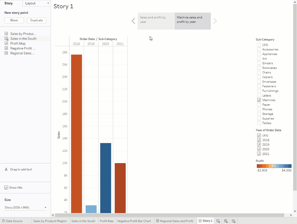
2) From the Story pane on the left, drag the Sales in the South worksheet onto your view.
3) Add a caption—maybe "Sales and profit by year"—by editing the text in the gray box above the worksheet.
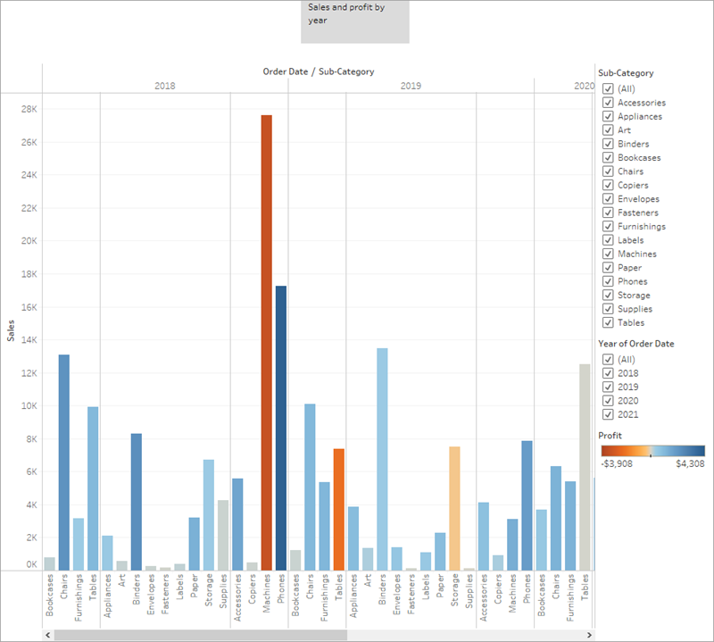
This story point is a useful way to acquaint viewers with your data.
But you want to tell a story about selling machines in North Carolina, so let's focus on that data.
Highlight machine sales
To bring machines into the picture, you can leverage the Sub-Category filter included in your Sales in the South bar chart.
1) In the Story pane, click Duplicate to duplicate the first caption. Continue working where you left off, but know that your first story point will be exactly as you left it.
2) Since you know you’re telling a story about machines, on the Sub-Category filter, clear the selection for (All), then select Machines.
Now your viewers can quickly identify the sales and profit of machines by year.
3) Add a caption to underscore what your viewers see, for example, "Machine sales and profit by year."
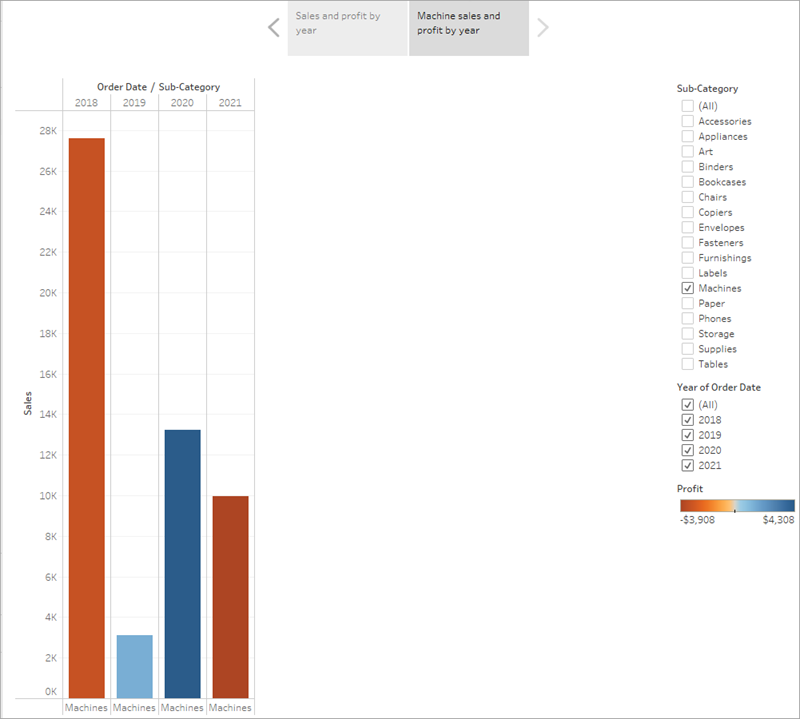
You've successfully shifted the focus to machines, but you realize that something seems odd: in this view, you can't single out which state is contributing to the loss.
You'll address this in your next story point by introducing your map.
Check your work! Watch "Create your first story point" and "Highlight machine sales" in action.
Make your point
The bottom line is that machines in North Carolina lose money for your company. You discovered that in the dashboard you created. Looking at overall sales and profit by year doesn't demonstrate this point alone, but regional profit can.
1) In the Story pane, select Blank. Then, drag your dashboard Regional Sales and Profit onto the canvas.
This gives viewers a new perspective on your data: Negative profit catches the eye.

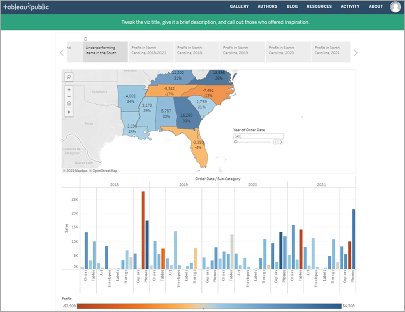
2) Add a caption like, "Underperforming items in the South."
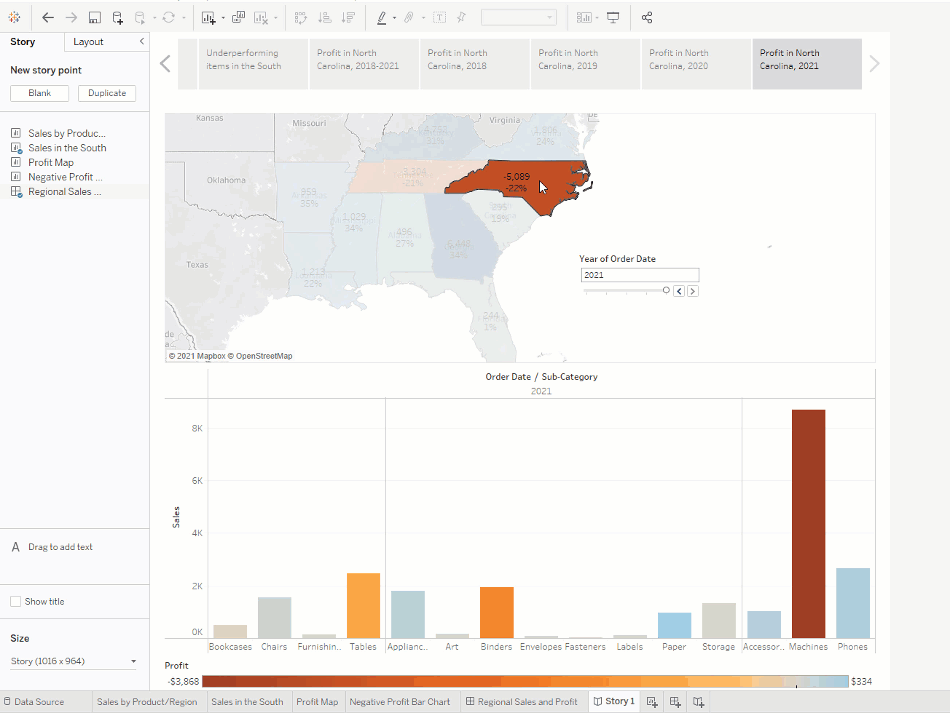
To narrow your results to just North Carolina, start with a duplicate story point.
- Select Duplicate to create another story point with your Regional Profit dashboard.
- Select North Carolina on the map and notice that the bar chart automatically updates.
- Select All on the Year of Order Date filter card.
- Add a caption, for example, "Profit in North Carolina, 2018-2021."
Now you can walk viewers through profit changes by year in North Carolina. To do this, you will create four story points:
- Select Duplicate to begin with your Regional Profit dashboard focused on North Carolina.
- On the Year of Order Date filter, click the right arrow button so that 2018 appears.
- Add a caption, for example, "Profit in North Carolina, 2018," and then click Duplicate.
- Repeat steps 2 and 3 for years 2019, 2020, and 2021.
Now viewers will have an idea of which products were introduced to the North Carolina market when, and how poorly they performed.
Check your work! Watch "Make your point" in action.
Finishing touches
On this story point that focuses on data from 2021, you want to describe your findings. Let's add more detail than just a caption.
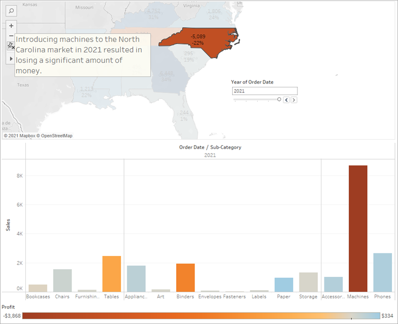
1) In the left pane, select Drag to add text and drag it onto your view.
2) Enter a description for your dashboard that emphasizes the poor performance of machines in North Carolina, for example, "Introducing machines to the North Carolina market in 2021 resulted in losing a significant amount of money."
For dramatic effect, you can hover over Machines on the Sales in the South bar chart while presenting to show a useful tooltip: the loss of nearly $4,000.
And now, for the final slide, you drill down into the details.
3) In the Story pane, click Blank.
4) From the Story pane, drag Negative Profit Bar Chart to the view.
5) In the Year of Order Date filter card, narrow the view down to 2021 only. You can now easily see that the loss of machine profits was solely from Burlington, North Carolina.
6) In the view, right-click the Burlington mark (the bar) and select Annotate > Mark.
7) In the Edit Annotation dialog box that appears, delete the filler text and type: "Machines in Burlington lost nearly $4,000 in 2021."
8) Click OK.
9) In the view, click the annotation and drag it to adjust where it appears.
10) Give this story point the caption: "Where are we losing machine profits in North Carolina?"
11) Double-click the Story 1tab and rename your story to "Improve Profits in the South".
12) Review your story by selecting Window > Presentation mode.
Check your work! Watch "Finishing touches" in action.
After you present
Your presentation went very well. The team is convinced that there is work to be done to increase profit in Burlington, North Carolina. And, they're curious to know why machines did so poorly in the first place. Your boss is thrilled—not only have you identified a way to address negative profit, you've got the team asking questions about their data.
To keep the lessons fresh in their minds, your boss asks you to email your team a document with your findings. It's a good thing that you know about sharing your visualizations with Tableau Server and Tableau Public.
Step 8: Share your findings
You've done a bunch of work—great work—to learn that Burlington, North Carolina needs some fine tuning. Let's share this information with your teammates.
Before you continue, select an option below:
-
If you or your company does not use Tableau Server, or if you want to learn about a free, alternative sharing option, jump to Use Tableau Public.
-
If you or your company uses Tableau Server, and you are familiar with what permissions are assigned to you, jump to Use Tableau Server.
Use Tableau Public
Your story was a hit. You're going to publish it to Tableau Public so that your team can view it online.
Note: When you publish to Tableau Public, as the name suggests, these views are publicly accessible. This means that you share your views as well as your underlying data with anyone with access to the internet. When sharing confidential information, consider Tableau Server(Link opens in a new window) or Tableau Online(Link opens in a new window).
1) Select Server > Tableau Public > Save to Tableau Public.
2) Enter your Tableau Public credentials in the dialog box.
If you don't have a Tableau Public profile, click Create one now for free and follow the prompts.
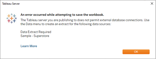
3) If you see this dialog box, open the Data Source page. Then in the top-right corner, change the Connection type from Live to Extract.
4) For the second (and last) time, select Server > Tableau Public > Save to Tableau Public.
5) When your browser opens, review your embedded story. It will look like this:
6) Click Edit Details to update the title of your viz, add a description, and more.
7) Click Save.
Your story is now live on the web.
8) To share with colleagues, click Share at the bottom of your viz.
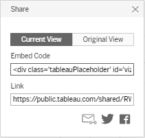
9) How do you want to share your story?
a. Embed on your website: Copy the Embed Code and paste it in your web page HTML.
b. Send a link: Copy the Link and send the link to your colleagues.
c. Send an email using your default email client by clicking the email icon.
d. Share on Twitter or Facebook by clicking the appropriate icon.
After you've completed these steps, click here to jump to the final section of the tutorial.
Use Tableau Server
Your story was a hit. You're going to publish it to Tableau Server so that your team can view it online.
Publish to Tableau Server
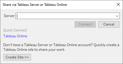
1) Select Server > Publish Workbook or click Share on the toolbar.
2) Enter the name of the server (or IP address) that you want to connect to in the dialog box and click Connect.
3) In the Name field, enter Improve Profits in the South.
4) If you want, enter a description for reference, for example "Take a look at the story I built in Tableau Desktop!"
5) Under Sheets, click Edit, and then clear all sheets except Improve Profits in the South. Learn more: Share more than just your story.
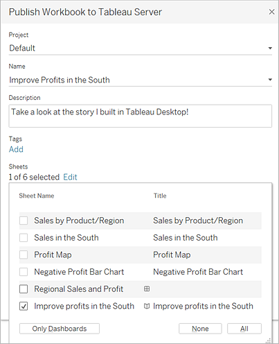
6) Click Publish.
Tableau Server opens in your internet browser. If prompted, enter your server credentials.
The Publishing Complete dialog box lets you know that your story is ready to view.
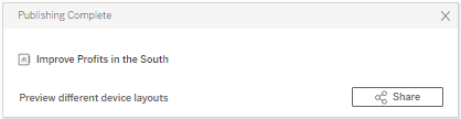
Great work! You've successfully published your story using Tableau Server.
Send a link to your work
Let's share your work with your teammates so that they can interact with your story online.
1) In Tableau Server, navigate to the Improve Profits in the South story that you published. You will see a screen like this:
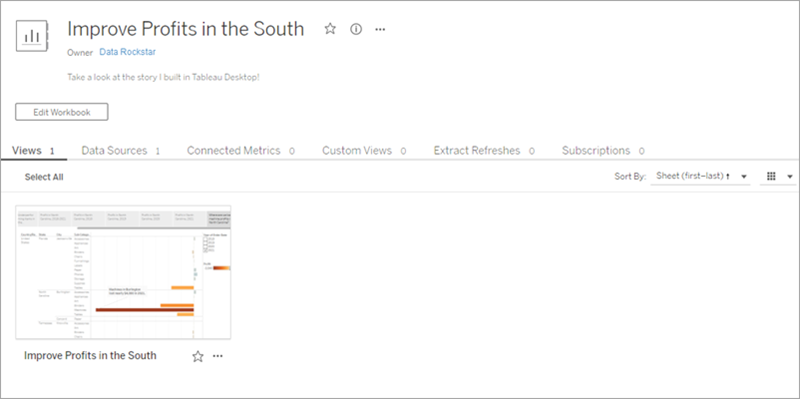
If you had published additional sheets from your workbook, they would be listed alongside Improve Profits in the South.
2) Click Improve Profits in the South.
Your screen will update to look like this:
Awesome! This is your interactive, embedded story.
3) From the menu, select Share.
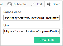
4) How do you want to share your story?
a. Embed on your website by copying the Embed Code and pasting it in your web page HTML.
b. Send a link by copying the Link and sending the link to your colleagues.
c. Send an email by using your default email client: Click the email icon.
Source: https://help.tableau.com/current/guides/get-started-tutorial/en-us/get-started-tutorial-connect.htm